

Author: Katherine Wray
Institution: Rhode Island School of Design
Date: July 2007
ABSTRACT
By using principles of the creative design process, a series of low-level prototypes and user studies were created to inform the design of an information visualization technique that deals with the problem of visually representing information quality. Understanding and clearly representing information quality is an important step in overcoming the problems of "information overload", a term used to describe the problem of having stronger data collection than data processing techniques. The hypothesis was that illustrative rendering techniques would be an intuitive and effective means for the display of information quality in multidimensional datasets. The user studies showed that to a general population exposed to familiar imagery, illustratively rendered areas of that imagery do intuitively appear to be of a lower quality than realistically rendered areas. When given that low quality is represented by illustrative rendering techniques, users can distinguish various levels of quality within a visualization, isolate specific areas of low quality within a larger visualization, and interpret locations of low quality regions within a three-dimensional visualization.
INTRODUCTION
As capabilities for capturing data increase, so too does the difficulty of analyzing a large collection of information and determining what are its important messages and underlying patterns. This familiar problem of information overload stretches across many disciplines of the sciences and has, in part, given birth to the field of Information and Scientific Visualization. The goal of data visualization is to present data in a format that can be more easily processed and given meaning by utilizing human visual capabilities.
An increasingly important aspect of data, and therefore of data visualization, is the meta-data characteristic of quality' attached to a data set or particular piece of information. Quality in a data set can relate to error, accuracy, precision, validity, variability, noise, completeness, confidence, consistency, lineage, currency/timing, credibility, subjectivity, reliability and interrelatedness (Pang et. al 1997; Thomson et. al 2005). The specific shortcomings that designate a set of data as being of "low quality" or "high quality" are only definable within the context of particular projects and methods of collection. The commonality lies in the way in which these shortcomings affect the analysis of the data set; in most data analysis situations, data that is of "low quality" should be given less consideration than data that is of "high quality." By creating a hierarchy of data importance, quality meta-data goes a long way towards solving the problems of information overload.
Within the visualization design community, some common methods for representation of information quality within a multidimensional dataset include glyphs, opacity, color, and texture modifications (Pang et. al 1997; Djurcilov et. al 2001; Wittenbrink et. al 1996); each of these methods has its strength and weaknesses, but none seem to holistically address the problem. While glyphs have the capability to add a new set of parameters to the original visualization, they can be very difficult to locate in the three dimensional space of the original data set, creating an unclear relationship between data and quality. Transparency manipulations (i.e., mapping low quality to transparency) very effectively highlight the high quality data of the data set, but often compromise the context of that data in doing so. Color manipulations are normally already mapped to a certain factor within a multidimensional dataset. Likewise, texture variations (i.e, bumps, noise, etc. on a three-dimensional surface) are often not an option in multidimensional data sets. For example, in a multi-dimensional visualization of a geographical area, surface bumps would be interpreted as the topography of the area represented, rather than as quality meta-data. All of these factors make it difficult to incorporate quality meta-data into complex visualizations. What visualization method could be used to represent low quality of information in a clear and intuitive way, without obscuring the context of the information or adding further levels of complexity to the visualization?
In the traditional "pencil and paper" design process, the designer initially communicates an idea with a sketch or rough drawing of the concept. These sketches are understood as uncertain approximations of an idea. As decisions regarding the project are made and finalized, detail is added and the sketch is developed into a more realistic rendering of the same concept. A detailed and realistic rendering communicates a high level of certainty to a viewer.
To introduce the use of illustrative rendering to depict lower quality or unimportant information, Figure 1 presents a visualization of an emergency management scenario. The use of realistic rendering styles overemphasizes the importance of much of the information in the visualization. By altering the rendering style to use sketching and shading styles as shown (Figure 2), the unimportant information is deemphasized and placed in the context of background while not removing its contextual significance from the visualization.

Figure 1: A sample visualization from an emergency management application. The visualization is rendered in a realistic style throughout, granting equal emphasis to important and unimportant information
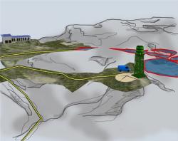
Figure 2: Unimportant areas of the visualization are now displayed as illustratively rendered. The areas of importance within the visualization are now emphasized and the context of the information is retained
Illustrative rendering techniques in computer science are created to mimic the look of an actual artist's rendering of an object. The techniques mimic many different artistic media, from pencil sketches to impressionistic paintings. They are often used to create more aesthetically pleasing or readable visualizations, and in some applications (Laidlaw 1998) as textures that treat individual marks or brush strokes as glyph-like elements. The Adobe Photoshop software provides a selection of Artistic Rendering techniques and other filters for editing two-dimensional imagery. Čadik (2004) provides a thorough survey of the various filters and viewers' perceptions of them.
The hypothesis in this present study is that illustrative rendering techniques are an intuitive and efficient manner for the representation of information quality meta-data in visualizations of multi-dimensional datasets (Stephenson et. al 2006). The proposal is that if areas of an image are rendered artistically, they can be interpreted as having low information quality.
This paper overviews the use of illustrative rendering techniques for depicting low quality information in a visualization and discusses the results of user studies conducted to evaluate the effectiveness of this idea. The study was conducted by an interdisciplinary design group which utilized the skills of visual designers to prototype the visualization. In the creative design process, comparatively little emphasis is placed on the production phases of the process, and instead emphasis is placed on the initial phases of the design process. These phases may vary, but generally consist of a problem definition phase followed by an ideation phase, and then by the testing of prototypes and refining of concepts. Rather than using time and resources to develop a fully functional rendering application to test our idea, we utilized the idea of low-level prototype creation and evaluation to better inform our design of visualization techniques. By forming an interdisciplinary design group that sought to use the strengths of the two different design communities, we were able to quickly and with minimal resources execute a number of user studies to evaluate the effectiveness of the illustrative rendering techniques as representations of low quality information.
METHODS AND MATERIALS
Overview of User Study
The larger goal of this project is to develop an application that maps illustrative rendering techniques to information quality meta-data in a multidimensional data set.
Eventually, this application should be tested in context of visualizations for specific disciplines, with visualization experts as a user group. However, if it is not intuitive for a non-expert viewer to interpret illustrative rendering techniques as low quality, the hypothesis is faulty and there are more effective means of representing information quality.
In order to assess the response of non-expert viewers to the concept of illustratively rendered information as low quality information, and to test and refine the hypothesis that this method of representing information quality would be effective, the studies are based on imagery that is easily understood by the general population. We chose simple examples of satellite and medical imagery.
The initial study was run to determine whether or not a viewer can interpret illustratively rendered information as of lower quality than photo-realistically rendered information.
The second study was run to evaluate the performance of the illustrative rendering techniques in relation to several key visualization concepts.
The initial study's user group was composed of individuals (N=37) attending a military technology conference. The second study's user group was composed of volunteers (N=12) from the metro Providence area. No visualization specialists or specialists in the study subject matter were included in the user groups. Specialists were excluded in order to avoid the influence of biases introduced through training or familiarity with the subject matter in a different context.
Image Preparation
We created series of images that, although the illustrative rendering techniques were applied only to the two-dimensional images, appeared to have been illustratively rendered partially or fully in their initial renderings. The images were prepared using a combination of hand drawings, automatic and custom Photoshop filters, and manual pixel painting.
We chose painting, sketching, outlining, and stippling as the illustrative rendering techniques to evaluate in our user studies (see Figure 3). By our definitions, painted renderings appear to have been created with a directional paintbrush stroke discernible due to some abstraction of detail and some visible texturing. Sketched renderings appear to be drawn with a pencil either in black and white pencil sketches or with colored pencils. Outlined renderings have thicker lines between two areas of contrast, creating edges or outlines. Stippled renderings use varying densities of points or dots to create the effect of light and volume in a drawing.

Figure 3: From left to right, examples in black and white of the sketch, paint, outline, and stipple techniques
While creating these effects in the images, it was sometimes necessary to adjust the contrast or brightness of the illustratively rendered portion of the image in order to keep it consistent with the original imagery. Heightened contrast within the illustratively rendered region could lead to an interpretation of the region as being of high quality rather than low, because a slight increase in an image's contrast actually gives it an appearance of being sharper or better defined. Likewise, if the illustratively rendered region was darker or lighter than the original imagery, it could also effect the interpretation of the visualizations.
Study One
Study one was created to determine whether or not a non-expert audience could interpret illustratively rendered images as of low quality when compared to a photorealistic camera image. The images in Study 1 were stock satellite photography of a small desert town. Each image contained two "regions": one that was illustratively rendered, and one that was rendered in a typical photorealistic manner (Figure 4). The participants were asked through a point and click Macromedia Flash-based interface to define which region gave a greater sense of a high quality of information.

Figure 4: An example of the imagery presented to users in Study 1. From left to right, showing an example with a sketched region, a painted region, a stippled region, and an outlined region. Each technique was used in color and in black and white in the study
In order to create the effect of a painted rendering, the "Angled Strokes" category in the "Brush Strokes" category of the Adobe Photoshop filters was used. We found the strokes to be more visible when applied in one direction only, and kept the stroke length and sharpness both in mid range as these parameters made the rendered area clearly visible without obscuring the information.
To create the sketched effect (as with a pencil or colored pencil), the "Brush Strokes / Crosshatch" Photoshop filter was used. As this filter tends to exaggerate the contrast in the crosshatch rendered portions of the image, the contrast of those portions was lowered to a level consistent with the rest of the image.
Custom filters were used to create the outline effect. Four separate layers one each to emphasize the edges upwards, downwards, left and right were created and merged to create an outlined effect. The Accented Edges and "Ink Outline" filters in Photoshop create dark lines between any areas of contrast in the images and had a tendency to obscure rather than outline the details of the original image.
In order to create the stippled effect, we used the "Texture/Grain/Stipple" filter in Photoshop. However, as this filter is only available in black and white, we used a semi-transparent layer (or several slightly varied layers) of the stippled image coupled with the original color image to simulate a color stippled effect.
Study Two
Study two was created to further explore the capabilities of Illustrative Rendering Techniques as representations of low information quality. The images in study two were from a three-dimensional data set of a human foot obtained from the National Library of Medicine's Visible Human Project and were rendered using the StingRay Volume Rendering system in a style visually similar to an x-ray. They were monochromatic and showed the bones of the foot in several different orientations.
We chose to split the study into three tasks to examine the illustrative rendering techniques in relation to three key elements of information quality visualization. The goal of task one was to determine if and how well a viewer could distinguish between varying levels of information quality (very poor quality, poor quality, good quality, or very good quality) mapped to the degree to which the image was illustratively rendered. The goal of task two was to determine if and how well a viewer could isolate the specific areas of the image which exhibited low information quality. The goal of task three was to determine if a viewer could understand the location of the illustratively rendered region in a three-dimensional space.
Task One
The images in task one of study two were created in sets of four. One of the images remained in its original fully rendered state, while the other three of the set were edited to appear illustratively rendered. The three edited images were prepared to show an increasing intensity of application of the illustrative rendering technique, representing a decrease in information quality as shown (Figure 5).
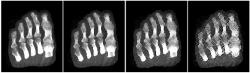
Figure 5: A lineup of images, displaying an increase in the intensity of application of the artistic rendering technique as the information quality decreases
In the painted images, this involved adjusting the stroke length and sharpness of the "Angled Strokes" Photoshop filter. The image became more abstracted (due to the stroke length) and the paintbrush texture became more visible (due to the sharpness adjustments) with the decrease in information quality.
In the sketched images, the various levels of quality were achieved by adjusting the stroke length and sharpness of the "Crosshatch" Photoshop filter. Once again, the image became more abstracted and the crosshatch pencil texture became more visible with the decrease in information quality.
In the stippled images, the varying degrees were created by adjusting the visibility of the semi-transparent "Stippled" layer which was laid over the original imagery. As the quality decreased, the image became more abstracted and the stippling texture more visible.
In the outlined images, the varying levels of quality were displayed by increasing the thickness and visibility of image outlines. In order to also create the effect of image abstraction to the same extent as the other techniques, the outlines were placed on a layer above the original image and the transparency of the original image was decreased according the level of information quality.
Task Two
The images in task two of study two were partially rendered in their original style, and partially with an illustrative rendering technique. The images were overlaid with a six by six box grid, and a number of consecutive boxes (randomly between eight and 15) were rendered with an illustrative rendering technique as shown (Figure 6).
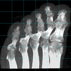
Figure 6: An image showing the bones of the human foot with some areas of low quality information, displayed with the sketch technique
The regions rendered with an illustrative rendering technique all exhibited the "very poor quality" information level according to the parameters of task one. The filters used to create the illustratively rendered regions, and the contrast and/or brightness adjustments used to match the regions with the original image, were the same as those mentioned in Task 1.
Task Three
The images of Task three of Study two were also partially rendered in their original style and partially rendered with an illustrative rendering technique. Using the StingRay volume rendering system, we captured images of the three-dimensional renderings of the bones of the foot in several different orientations and from several different angles.
We arranged the images into pairs, and did one of two things with each pair.
(1) We chose a particular region of one of the images (i.e., the big toe of the foot), and made it appear to have been rendered using an illustrative rendering technique. We then chose the same region of the other image of the pair ( i.e., the big toe of the foot), and made it appear to be rendered using an illustrative rendering technique.
(2) We chose a particular region of one of the images (i.e., the big toe of the foot), and made it appear to have been rendered using an illustrative rendering technique. We then chose a nearby but different region of the other image of the pair (i.e., the second toe of the foot), and made that region appear to have been rendered using an illustrative rendering technique.
We displayed a pair of images to the user as shown (Figure 7) and asked them to determine whether the same region had been illustratively rendered in each of the images (as in description one above), or whether the illustratively rendered region was different from one to the next (as in description two above).

Figure 7: A pair of images showing the bones of a human foot in different orientations. The same region (in this example the bones of the big toe & the adjacent toe) has been illustratively rendered with the stipple technique in both images
Data Analysis
The data used for analysis were the total number of yes/no (success or failure) experiments, the probability of success for each experiment, and the total successes achieved, where "success" was defined as responses which identified the use of illustrative rendering techniques as representing low quality. Data were analyzed using either the binomial distribution test or t-tests with a significance level (alpha value) of less than 5%.
RESULTS
Overall, 95.6% of the responses (from thirty-seven study participants given eight questions each) identified the illustratively rendered regions of the image as low quality information (Table 1). These results are shown to be statistically significant by the binomial distribution test (p-value < 0.05).
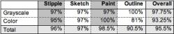
Table 1: The percentage of responses indicating that the illustrated region of the image conveyed low quality information
The results of Study 2 showed the illustrative rendering techniques as representations of information quality. Task one showed that a viewer is able to decipher varying levels of information quality based on the intensity of the application of artistic rendering technique. The percentages of correctly identified quality levels (52% for the outline technique, 57% for the paint technique, 76% for the sketch technique, and 73% for the stipple technique) were all shown to be statistically significant in favor of our hypothesis by using the binomial distribution probability test (all p-values less than 0.05) (Table 2).

Table 2: The number of correct answers by technique in Part 1 of the second user study
Task two showed that a viewer is able to isolate specific regions of low information quality within an otherwise fully rendered image. The p-values for six of the eight questions were well below the alpha value, but two of the questions had no completely correct responses and so the binomial distribution test could not be used. In order to more clearly compare the performance of the techniques to one another, we recorded correct, false positive, and false negative responses, and totaled the false positive and false negative to come up with an error value for each example (Table 3). Using the test-test, the outline technique had a significantly higher error value than the other three techniques (p-value < 0.05), but no other comparisons were significant.
Task 3 shows that regions rendered with the sketch, stipple or outline technique can be correctly identified in a three dimensional space. The paint technique performed poorest with just 50% correct identification (p-value = 0.55) (Table 4).

Table 3: The error values (false positives and false negatives) and standard deviations by technique for Part 2 of the second user study
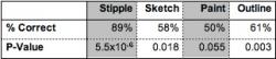
Table 4: The percentage of correct responses for Part 3, by technique, and the corresponding P-values as a result of the binomial distribution test
DISCUSSION & CONCLUSION
The results of the initial user study supported our hypothesis that viewers intuitively perceive illustratively rendered information as of lower quality than photo-realistically rendered information of the same data set. The studies showed that illustrative rendering techniques are an effective means for displaying information quality meta-data in multidimensional datasets. Their emphasis on the prototyping and evaluation phases of the process helped to create a well-informed theoretical basis for the development of an actual application, without using unnecessary time and resources.
However, there are still limitations with the present study. Because the participants were not given a specific definition of what the determining factor was in designating a part of the visualization as low quality, some participants had difficulty understanding the concept of information quality in an abstract sense. It is difficult to say how this affects the results. Task two of the second user study was difficult to analyze because the structure of the questions allowed for too much variation in user response. Another method of testing for the same information would be preferable. In Task three of the second user study, there was confusion specifically related to the lack of three-dimensional interaction (e.g., the ability to control pitch and roll of the visualization subject matter).
Further work must include the development of an actual application that can render low quality information using illustrative techniques in multidimensional datasets. Three-dimensional rendering applications using illustrative techniques to express volume have been under development for years in other projects and currently include each of the techniques we used in our studies (Lu 2002; Salisbury 1997; Healey 2002; Lansdown 1995). Once an application has been developed, further studies should be conducted to explore more realistic three-dimensional user interaction with the application than we were able to explore using the prototyping techniques. Future studies should address the research towards a specific application underwater, emergency management, medical visualization, etc so that visualization experts in a particular field can be used to examine the efficacy of the techniques.
ACKNOWLEDGEMENTS
This research is based upon work supported by the National Science Foundation under Grant No. 0353786 and under Subcontract No. OS-05-2221 to Ocean State Technology Corporation as a part of the NAVSEA 03 CARUSO initiative.
REFERENCES
Čadik, M. (2004) Human Perception and Computer Graphics. Postgraduate Study Report DC-PSR-2004-06, Dept. Computer Science and Engineering, Czech Technical University.
Djurcilov, S., Kim, K., Lermusiaux, P. & Pang, A. (2001) Volume Rendering Data with Uncertainty Information. Proceedings of Data Visualization 2001, 243-252.
Healey, C.G., and Enns, J.T. (2002) Perception and Painting: A search for effective, engaging visualizations. IEEE Computer Graphics and Applications, 10-15.
Johnson, C. & Sanderson, A. (2003) A Next step: Visualizing Errors & Uncertainty. IEEE Computer Graphics and Applications 23(5): 6-10.
Laidlaw, D. H., Ahrens, E.T., Kremers, D., Avalos, M.J., Jacobs, R.E., and Readhead, C. (1998) Visualizing Diffusion Tensor Images of the Mouse Spinal Cord. Proceedings Of IEEE Visualization '98, 127-134.
Lansdown, J. and Schofield, S. (1995) Expressive rendering: a review of nonphotorealistic techniques. IEEE Computer Graphics and Applications 15(3), 29-37.
Lu, A., Morris, C., Ebert, D., Rheingans, P., and Hansen, C. (2002) NonPhotorealistic Volume Rendering Using Stippling Techniques. Proceedings Of IEEE Visualization 2002, 211-218.
Olston & MacKinlay, J. (2002) Visualizing data with bounded uncertainty. Proceedings of IEEE Symposium on Information Visualization 2002, pp. 37-40.
Pang, A., Wittenbrink, & Lodha. (1997) Approaches to Uncertainty Visualization. The Visual Computer, 13(8): 370-390
Salisbury, M., Wong, M., Hughes, J., and Salesin, D. (1997) Orientable Textures for Image-Based Pen-and-Ink Illustration. Computer Graphics 31, 401-406.
Schumann, J., Strothotte, T., Raab, A. & Laser, S. (1996) Assessing the Effect of Nonphotorealistic Rendered Images in CAD. Proceedings CHI'96, pp. 35-41.
Stephenson, P.D., Wray, K. and Encarnação, L.M. (2006) Using Illustrative Rendering in Visualization to Intuitively Depict Information Quality and Uncertainty. Proceedings Of Undersea Human Systems Integration Symposium, June 6-8, 2006.
Strothotte, T., Masuch, M., & Isenberg, T. (1999) Visualizing Knowledge about Virtual Reconstructions of Ancient Architecture. Proceedings of Computer Graphics International 1999, pp.36-43.
Thomson, J., Hetzler, B., Maceachren, A., Gahegan, M., & Pavel, M. (2005) A Typology for Visualizing Uncertainty. Proceedings of Visualization and Data Analysis 2005, 16-20.
Wittenbrink, C., Saxon, E., Furman, J., Pang, A. & Lodha, S. (1996) Glyphs for visualizing uncertainty in environmental vector fields. IEEE Transactions on Visualization and Computer Graphics, 2(3): 266-279. 17.